NURSERY DESIGN
An Eclectic Nursery That’s Effortlessly Chill
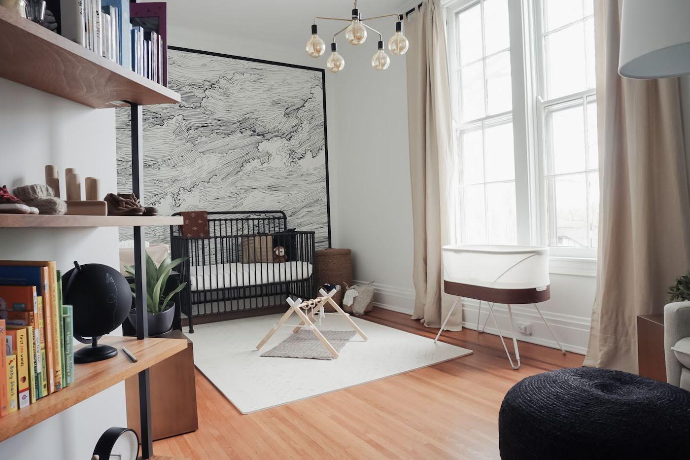
Cyndi Ramirez, the founder of Chillhouse, has an aesthetic that is predictably, well, chill. And that effortless cool echoes throughout her son’s nursery.

Written by
Happiest Baby Staff

Note: While these nursery photos are gorgeous, please know that it’s NOT safe to place stuffed animals, pillows, bumpers, or any loose items inside your infant’s sleep space until Baby is a year old. —Dr. Harvey Karp
Cyndi Ramirez, the founder of NYC self-care destination Chillhouse, has an aesthetic that is predictably, well, chill. And that effortless cool echoes throughout her baby Hendrix’s eclectic nursery.
She describes the finished nursery as an extension of their broader apartment design and a reflection of both her taste as well as her husband’s.
'We had come to an agreement about décor. I kept in mind his colour preferences while exploring my texture preferences,' she says. 'We brought in colours that already existed in our home—greens, grays, and wood.'
![[object Object]](https://cdn.sanity.io/images/301lhh0a/production/ef77a6561ca31fab0bab725d1f7d3982382a7516-384x480.jpg?w=828&auto=format&q=75&fit=max)
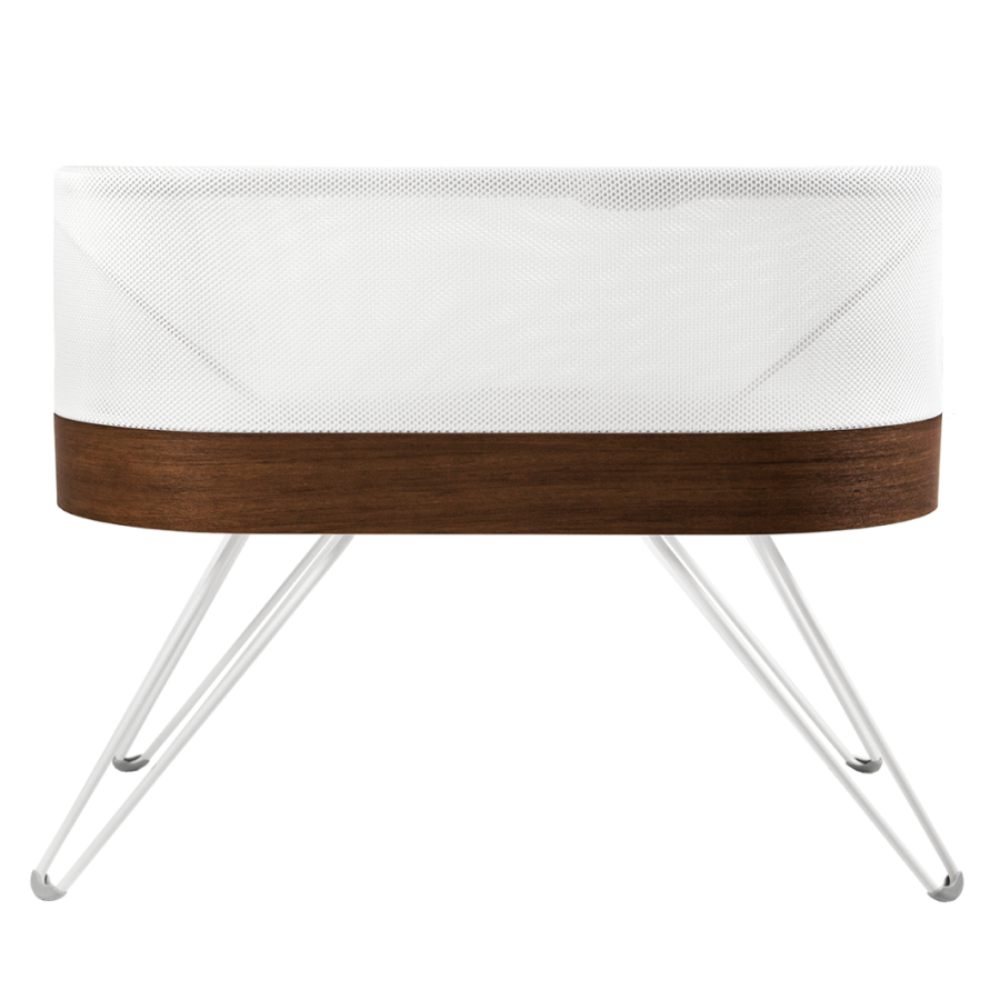
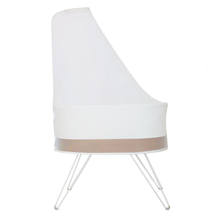
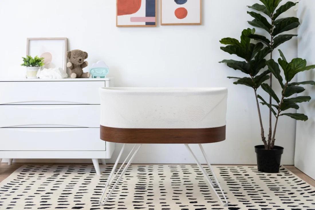
SNOO’s modern white-and-wood design fit right in with the rest of their decor, so from a design standpoint, it made total sense. 'It matches perfectly with our room, so it doesn’t feel like a distraction or obstructive object,' she says.
In addition to fitting in style-wise, SNOO is also a fit lifestyle wise—it has helped everyone get much-needed sleep.
'I’m loving it. He’s sleeping really well the second you put him in there,' she says. 'When he’s out, he stays out a long time, which is hard to come by in other bassinet and bed options.'
![[object Object]](https://cdn.sanity.io/images/301lhh0a/production/681ef670812485a5b4b6ef412bc81b789b14b206-384x480.jpg?w=828&auto=format&q=75&fit=max)
Cyndi also leaned into a slight animal theme with the nursery, aiming to make the baby room kid-friendly without being overly cutesy, she says.
You can see a handful of overt animal elements in a few spots around the nursery—like with a couple of pieces of art, stuffed critters, and the jungle-cat-print pillow.
There are more subtle nods to the animal kingdom as well. 'The lamp has a fish vibe to it with the scales and looks a little bone-like. I liked that to tie in the theme,' Cyndi says.
[Related: See more nursery ideas for boys]
But to mix things up are some eclectic—but totally personal—pieces of nursery art.
'There’s a vintage banner with his name on it that we had custom made, so there’s a collegiate vibe. Then there’s a fun little street sign to bring in the city vibe,' Cyndi says.
These one-of-a-kind finds are part of what makes the cot area Cyndi’s favourite part of the room.
![[object Object]](https://cdn.sanity.io/images/301lhh0a/production/a044edd2d2acaa3a8488e9a343a853d6b3fe7988-320x480.jpg?w=640&auto=format&q=75&fit=max)
'That whole area is very unique. It’s his own little corner that brings in the mix of things that are custom to us. It’s just very cosy and cute.'
For the cot itself—where Hendrix will sleep once he transitions out of SNOO—Cyndi chose one that complemented the other wood elements in the room, but also featured acrylic slats.
'I loved the acrylic paneling so we can actually see him, and I like not having a super bulky-looking wooden crib which would make the room look smaller,' she says. 'It opens up that area a bit, making the overall room less cluttered.'
A vintage rug cloaks the dark hardwood floors, and a modern dresser serves as Cyndi’s changing table.
![[object Object]](https://cdn.sanity.io/images/301lhh0a/production/d95262d2ceea946a250666c1a6883c621b8b75e7-480x384.jpg?w=1080&auto=format&q=75&fit=max)
'It was the right colour and right size and height for me. I’m short, so I want to be level to the changing table. I don’t have to tip-toe,' she says.
The mirror above Cyndi’s changing table was another thoughtful choice. 'We have a lot of brass and a lot of arches in our home, so the mirror ties in with that.'
![[object Object]](https://cdn.sanity.io/images/301lhh0a/production/e5fbfbebb754f962173897eacf4c98bbfb9d1637-360x480.jpg?w=750&auto=format&q=75&fit=max)
And, a bit of Chillhouse has crept into this corner of the room as well.
'We have a self-care area forming, with body lotions and face creams…stuff I’m excited to start using and exploring.'
Disclaimer: The information on our site is NOT medical advice for any specific person or condition. It is only meant as general information. If you have any medical questions and concerns about your child or yourself, please contact your health provider. Breastmilk is the best source of nutrition for babies. It is important that, in preparation for and during breastfeeding, mothers eat a healthy, balanced diet. Combined breast- and bottle-feeding in the first weeks of life may reduce the supply of a mother's breastmilk and reversing the decision not to breastfeed is difficult. If you do decide to use infant formula, you should follow instructions carefully.
SHARE THIS ARTICLE
PARENT PICKS
Bestsellers
